There Will Actually be Two Versions
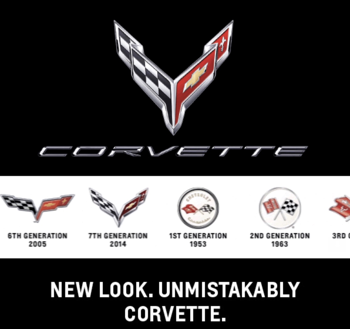
Chevrolet recently sent out an email with an image of the new C8 Corvette logo. The logo for the Corvette has leaked before, but this time it’s official. Chevrolet also unveiled the Corvette logo at the National Corvette Museum recently. It showed off two different versions of the C8 Corvette’s logo. The logos look very similar to the C7 Corvette logo, but with some minor updates to the design.
The two versions are actually quite similar. There’s a chrome one and a back one. Harlan Charles, a Corvette Product Manager talked with Corvette Blogger for a few minutes after Chevrolet unveiled the new logos at the National Corvet Museum’s “What’s New With the Corvette” seminar.
Charles said that the reason there are two logos is that many people like to have the logo of the Corvette match their specific car or its wheels. Having a light and dark version of the logo allows further customization. It gives the customer more control over their purchase.
The email Chevrolet sent out showcased the C7’s bright logo and shared a gif that actually showcased every generation of Corvette logo. The image above is just one frame of that gif. The copy of the email discussed the importance of the Corvette logo and how the new logo is an “evolution of the crossed flags emblem.”


