A Side-by-Side Comparison
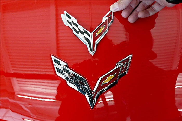
Chevrolet revealed the new C8 Corvette’s logo, which we recently reported on. The new logo is killer. You may have noticed it looks a lot like the C7 Corvette’s logo. With that said, it did change. Chevrolet may have taken an evolutionary approach to the logo rather than a revolutionary one, but it’s important to note the changes. A member of MidEngine Corvette Forum gave the world that comparison in the photos you see here.
As you can see, the two sides of the emblem are pulled together and actually connected at the bottom of the logo. It’s also a little tighter overall. It looks a little sleeker. This is a move to keep the well-known C7 Corvette logo intact while still giving the C8 something to call its own. The C8’s transition to a mid-engine design is a serious one. Because of this, Chevrolet likely wanted the logo to provide some semblance of normalcy or familiarity to customers.
The logo is just as attractive as it previously was, and it’s also instantly recognizable as a Corvette logo. Those two things are paramount for the Corvette brand as it moves into its new generation.
Chevrolet also shared a video with the world that showcased all of the logos throughout the life of the Corvette. This gives a comprehensive view of the Corvette logos and the changes over time. Check it out below and let us know what you think in the comment section.
A Corvette this different deserves a symbol all its own. …
A Corvette this different deserves a symbol all its own. Keep up with it here: https://s.chevy.com/an9zh
Posted by Corvette on Friday, April 26, 2019


